Pages

August 23, 2013

A recycled craft for the home


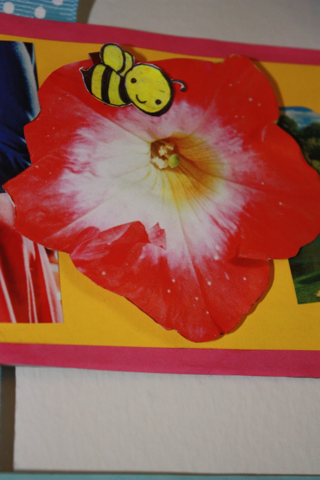
Hi all, here is another cute project to gear up the home. Here it is a totally recycled project where u can turn trash to treasure.Though this is pretty self-explanatory, yet, I made the 3 panels from the cardboard cereal boxes, cut into desired measures. I decked up these panels  with the letters, cut out from the colorful pages of the magazines that stocked up at our storage. As a paper lover I collected quite a few airport magazines from our latest international trip.These magazines are particularly loaded with a lot of colorful ads, and hence served a good purpose in decorating these panels,too.
These letters kinda gave it a collage look.
I also tried to create a 3D effect with the letters 'O' and the polka dotted blue ribbon is completely adorable adding some cutness to it. Its from Target. Here are some snaps of the wall hanging  in making.


Hope you guys like it. Let me know if you have any comments!

Cheers,
Creativebee.

August 15, 2013

Horses in the valley - glass painting in one evening


There are some days when you feel a sudden rush of energy flowing through your spine, that you jump out of your couch and do something which you have never thought of doing in one evening.

Here it is. I usually have all my painting materials ready in hand keeping only the plot in my head, marinated for some time to be cooked on canvas. One evening, when I was about to complete my one month pending novel, struck by this picture of running horses in a valley. And I felt like, it somehow naturally resembled my energetic feeling with the plot of this picture. So, finally I got it painted in a piece of glass in one go.

I used a 1 ft x 1.5 ft china glass (from a local glass market), "Reeves" acrylic paints (from Blick Art Materials, Chicago), black outliner (from the same shop above) and 2 paint brushes (#2 and #3).

Since the final product would be a mixture of so many colors and compositions, it was hard to put the colors in proper order. If you want to see white on top and then and shade of yellow to visualize the wave, you should apply the colors at the back of the glass rather than the front face of it. So, you can imagine the whole picture was colored in reverse order they way the shades are seen.

This painting is yet to be framed.

Hope you guys like it. Let me know if you have any comments!


July 30, 2013

Beginners' polka dotted nailart


This is an easy look to recreate that doesn't require too much steadiness.

STEP 1
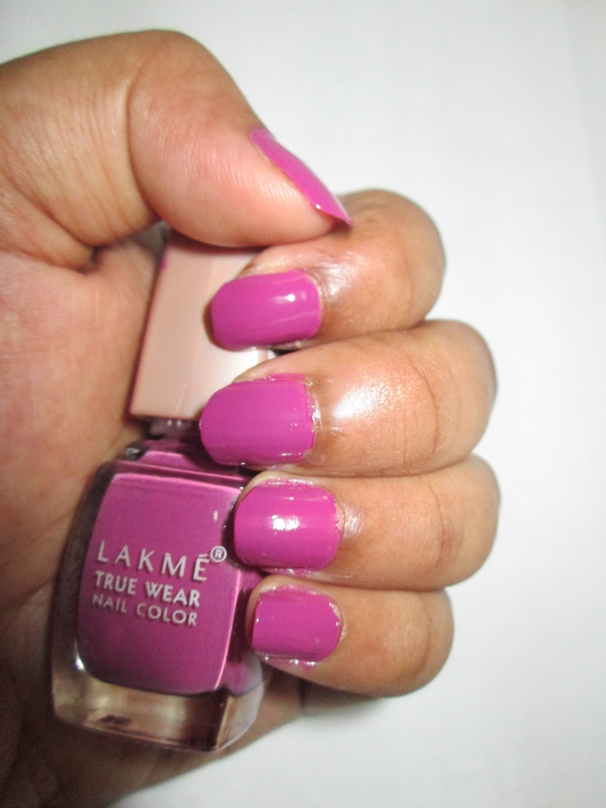
Apply 2 coats of your choice of nail polish.Here I used the lakme polish in N236,a warm purplish-pink.
STEP 2
Take your white polish or a light colored one like I used  a very light pink from wet n wild and with the dotting tool create a line of dots evenly spaced in the middle of the nail
STEP 3:
Do another line to the right of the first line and also on the left of the first one and try to space the dots to fall between the dots of the first line.
STEP4:
Then I used the white nail /light pink polish  to draw lines connecting the polka dots.
STEP5:
Then I added smaller sized polka dots on top of the bigger dots. I just used the smaller tool to create smaller dots. The blue I used is a dark navy polish from Maybelline denim collection.

STEP 6:
Let it dry thoroughly before applying a topcoat. You don't want it to smear!


N.B. Though it is fairly easy one to do,mine one didn't turn out that good.probably credit to my unsteady hands or the short nails.But believe me it is pretty easy and do look good if done well.
Dear fellow bloggers and visitors do comment.

Cheers,
Creativebee.

July 26, 2013

Lakme True Wear Nail color: FreeSpirit N236 Narendra Kumar: my experience

Happy Friday everyone! Here's a little review and my take on a nail polish , I picked up quite awhile ago.
this Lakme true nail color range is the good old range that I have been using since my teenage days.


Price:Rs 95 for 9ml.

Packaging:This comes in the traditional good old Lakme nail paint packaging with a beige cap.

My Opinion:-
I am a nail paint lover and therefore I try to keep buying different nail colors from different brands while also being on tight budget.
These nail polishes come in wonderful shades and every year Lakme launches new shades as part of a designer collection and this shade is from their famous Narendra Kumar collection.
This shade is in N236.
It is a warm plummy pink very close to purple shade. It has a Very nice glossy-thick finish to this one, almost a creamy/milky jelly finish and luckily without any shimmer.
The formula on these are very good.  They apply evenly with zero effort and they dry very quickly.  I have no complaints about the formula.  All are opaque in two coats and that's what I'm wearing here.

The nail paint has a nice flowy liquid texture which is neither thick nor runny.It dries to a creamy finish with a glossy touch but the glossiness fades in 3-4 days of application without a top coat. The nail paint lasts long on my nail.  With proper care and minimal work the nail-paint can stay fresh and last a week and a half easily.
In my case,it stayed without a top coat for 4 days with minimum chipping and fading and lost of household chores and dish washing especially,after which it fades off from the tips which is acceptable.

Nail color  with flash:


Pros:-

  •     Adorable plummy-pink shade with no shimmers
  •     Applicator brush gives an easy and even application
  •     Commendable staying power.
  •     Well-pigmented and gives a very opaque coverage in 2 full coats.
  •     Dries up quickly but not super-fast.
  •     Gives a nice glossy creamy finish to the nails but the shine fades off.
  •     Available in large number of shades like browns, Pinks, Mauves, Reds and Maroons.

Cons :-
  •     If you do a lot of household chores, the nail-paint starts fading off from the nail-tips by the end of 3rd day.
  •     The nail polish has become slightly thick over time.
  •     The shade gets darker with each coat. So, if you go for multiple coats of the shade it may turn weird and tacky,.
  • Astonishingly the beige cap of my bottle got separated from the inner part of the cap ,leadind to slipping away from hand and falling.

Its a beautiful shades just right for the winters and ,fall.This color will suit mostly fair and wheatish skin tones with ease. Its a must try for those who love pinks.I am in love with it,and planning to do  a nail art with this too. :D

July 18, 2013

Reverse glass painting: crane


Hi everyone! Just wanted to share another of my glass paintings.I got the inspiration from a painting over the Internet. The painting is approximately 8"by 10". Its actually one of the first of reverse glass painting in which I tried using acrylic paints. It was quite a challenge to create the shades on the cranes body.One of the advantages of acrylic paints is one can create any shades by blending the colors which is quite difficult in case of glass paints. Anyways though I know this one has lots of imperfections,still I liked  how it turned out,,am willing to try some more from time to time.It gives a bout of greenery,and brings freshness to my old room in Kolkata.


Cheers,

Sumitra